The Feed
Unintentional Discovery
💡 Context & Opportunity
At the time, users didn’t have a way to endlessly browse objects. They would always have to go from one list to another and search for an object they like.
Catawiki's Machine Learning team had already built a recommendations model, but its exposure was really limited to a small section on the Homepage limited to 10 objects.
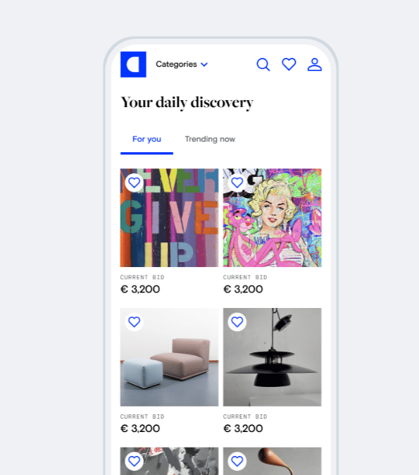
The unintentional discovery
Our users needed a way to casually browse and discover special objects in Catawiki, even when not sure what they’re looking for.
With “Your daily discovery” users can discover objects unintentionally, while browsing/scrolling endlessly.
- Objects are recommended to you based on your interactions with objects at Catawiki
- Recommendations are optimized for objects you're more likely to place bid on (first bid)
- Multi-category list of objects tailor-made for each user, not available anywhere else at Catawiki
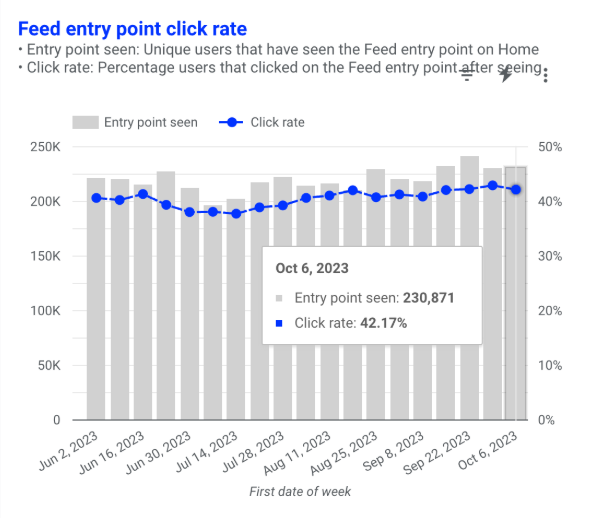
What about the traffic?
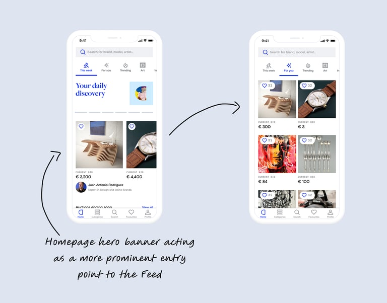
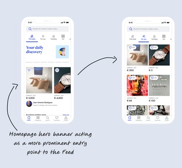
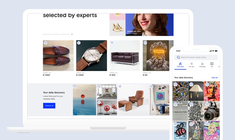
With the Feed MVP we learned the feed was a great driver for bidding. The opportunity was still on the discoverability, and driving more users to it. So, we improved the entry point to the Feed from the Homepage and moved it higher to increase visibility.
🧪 ...and we increased the traffic to the feed!
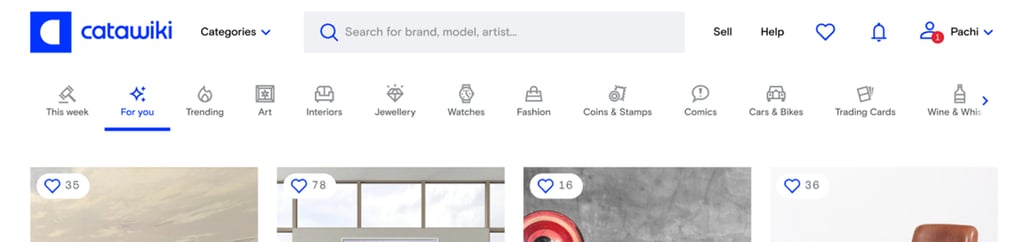
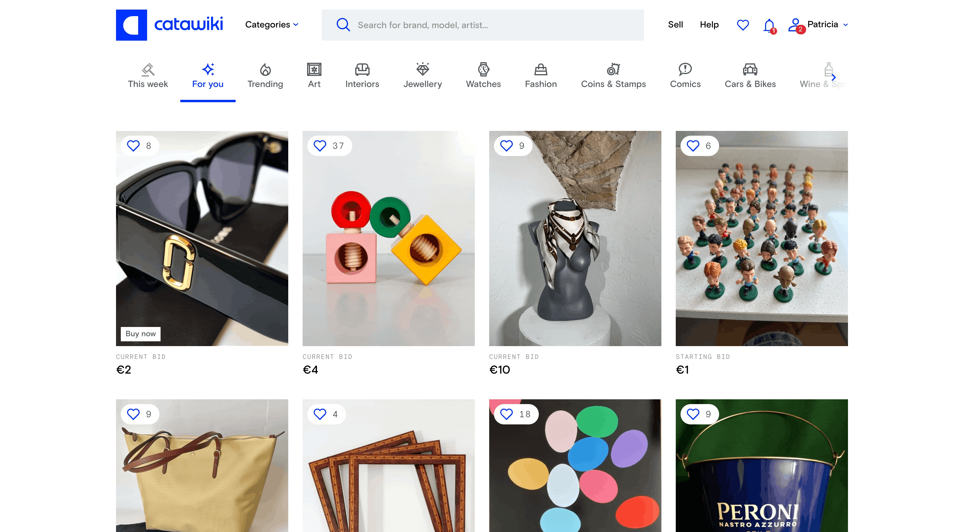
Feed entry point is composed by 9 objects. More diversity among these 9 objects drove more users to open Feed.
The Click-Through-Rate from Home to the Feed increased by +5.5%
... But this was not good enough
The feed is great for a user with a "Serendipity" mindset. But, how can we also help users that know what they are looking for?
We wanted to Provide users with a way to quickly swap discovery surfaces to allow a better integration of Serendipity and Specificity mindsets.
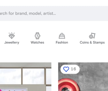
We also wanted to support Catawiki's branding and look&feel with unique custom icons (made by our visual designer, supported by me).
💡 We realised we were too deep in the "driving traffic to the feed" bubble. So we looked at Discovery in a more holistic way.
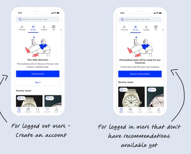
Empty states designs drove a significant increase in registrations
For users without an account - we explain why the "For you" tab looks empty, and we prompt them to create an account.
For newly registered users - we explain why they don't see anything yet (our recommendation model needed 24hrs to train when we launched this experiment.
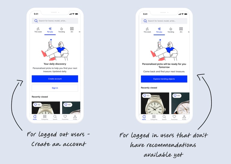
+2% in Registrations
Features like these, are never "done"
The feed continues to show big opportunities. On one side, our Machine Learning team continuously improved the recommendations model. On the other side, us in the product team, and specially on the Discovery team, are constantly looking ways to help our users find the object they love, even when they don't even know what they like.
Next experiment: adding a more prominent entry point to the Feed from the Homepage Hero banner. This will only be visible for logged in users. The idea is to make our Homepage a very personalized and relevant surface, designed to spark curiosity of our buyers. What better way of sparking curiosity than showing them the main objects that are recommended to them?