Catawiki's Homepage Hero
REDESIGNING
Context & Opportunity statement
Catawiki is an online auction house, where users can find +75,000 special objects curated by experts. Every week there’s new inventory across 16 different categories, but the Homepage shows very static content at the very top of the page. We saw a clear opportunity to improve the way truly special objects are manually picked and highlighted to all users.
🔁 The current banner is a carousel that plays automatically, always starting at the same view. Users can’t control it and might see the same hero on every home visit.
⌛ Marketing and brand teams are spending +7 hrs weekly updating the hero weekly (and manually).
Why redesigning the Homepage Hero?
⛔ We know users engage the most with content that shows objects; but the current hero only showed 1 object per view.
💎 We believe we can do better at positioning Catawiki's brand for both new and existing users.
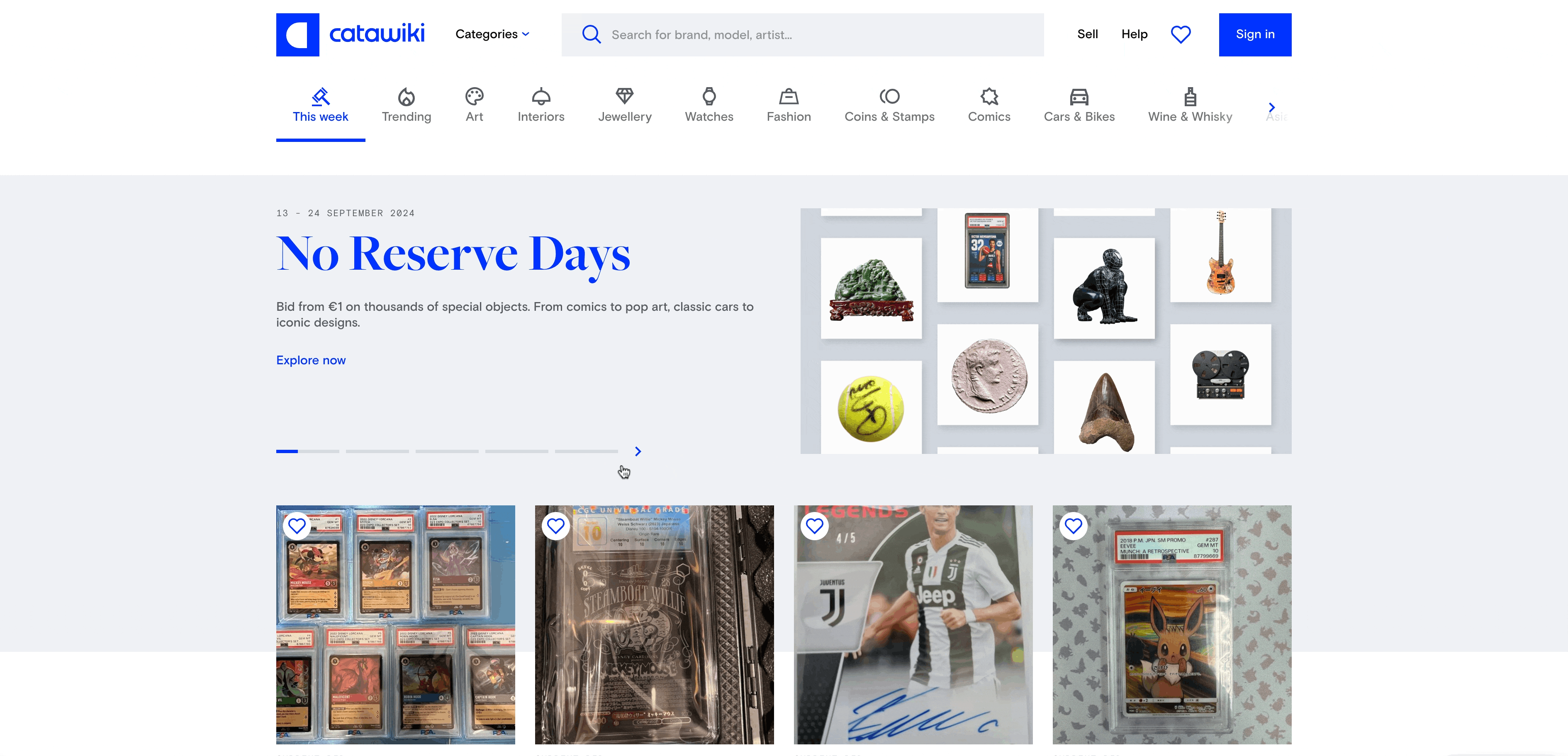
Homepage Hero before redesign.
How might we deepen buyer curiosity through Merchandising to strengthen the perception of Catawiki as a marketplace for special objects?
Research & Discovery

The main challenge of this project is we were designing a new Homepage Hero for the end users; while also improving the process to set it up internally.
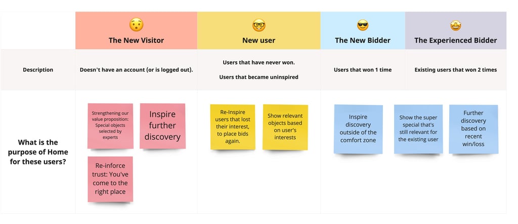
🚀 End User: The Passionate Enthusiast
Catawiki has always had Collectors as a main user group, but the business had made the conscious decision to target a wider group. These users have hobbies and passions, but they are not really collectors. Within this group, we have sub-segments with different needs and expectations we had to take into account.
🏠 Internal Use: Brand & Marketing team
Our stakeholders in the brand and marketing team were spending too many hours setting up the hero (+7 hours every week). They needed a smoother process to improve their productivity. We had to find the right balance between automation and creative freedom.
Actionable Insights
💡 Users want to be in control
We noticed users were frustratingly trying to swipe through the hero carousel.
💡 The journey has to make sense
Users that clicked on the hero banner ended up bouncing - Even when clicking directly on an object highlighted, they were taken to an unrelated page.
💡 Users engage with objects
The highest Click Through Rate on the Homepage came from the only section that showcased objects, even though that section was at the bottom of the page
Internal users: “Setting up the banner each week is frustrating, boring, and not efficient”.
💡 We need to make it easy for ourselves

Ideation process & Explorations
Several conversations with internal stakeholders to deeply understand their pain points in the process. In parallel, digging in the data to uncover the end users insights mentioned above
🔎 A lot of time understanding the problem
🐸 Jumping between ideation mindsets
How can we improve the internal process (feasibility)
How can we address our end user needs (desirability)
How can we measure business impact (viability)
Early explorations
The final solution was not simple
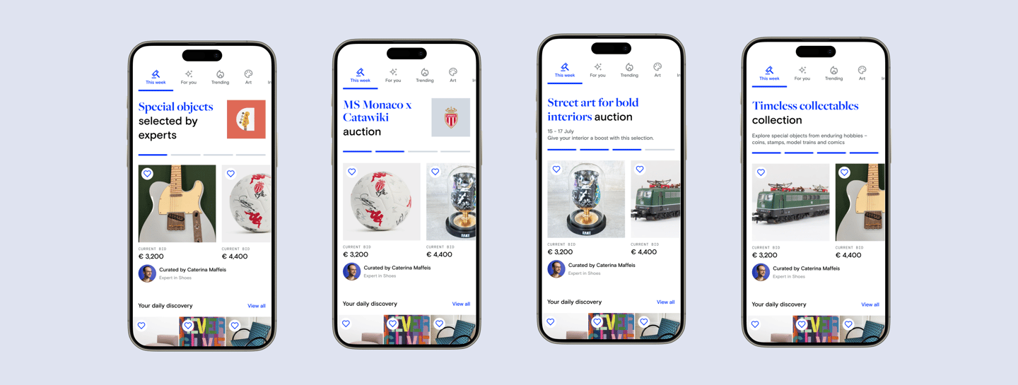
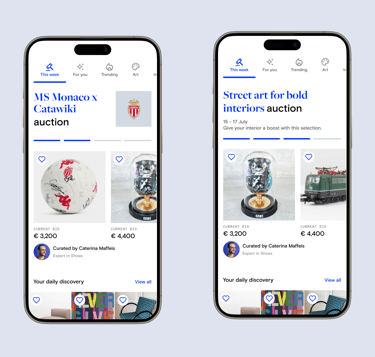
To cover all the communication needs from Marketing, the business and our end users, we came up with 2 big modes (Default mode and Trade Activation mode)
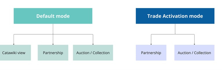
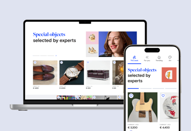
The Default Mode
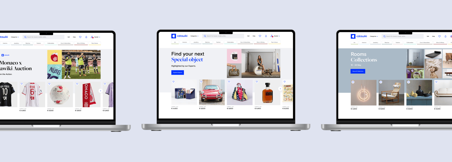
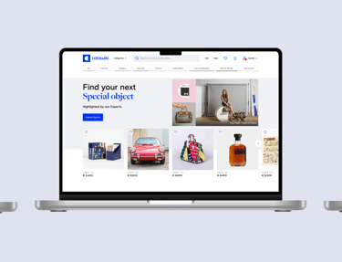
Catawiki View
Objective: Showcasing the diversity Catawiki has to offer, by highlighting 4 hero objects.
Fully automated.

Partnerships
Objective: Highlight a partnership making sure it looks and feel different from other BAU highlights.
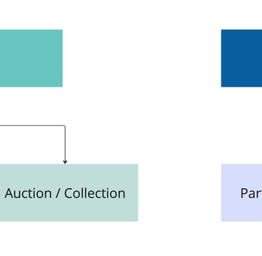
Objective: Featuring a special group of objects (auction or collections).
Featured Auctions & Collections
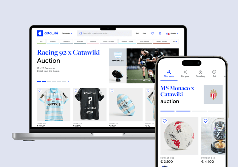
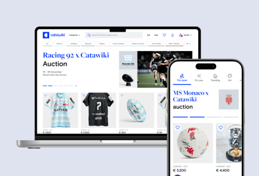


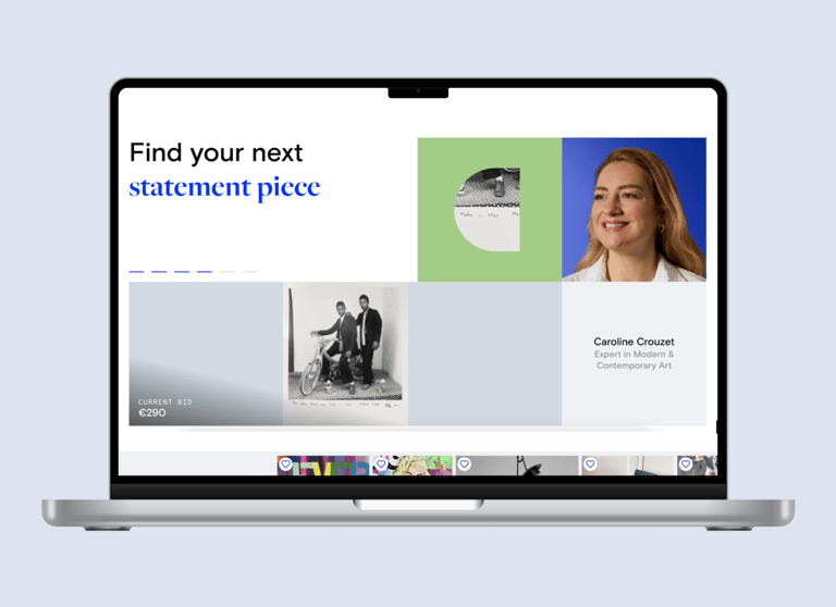
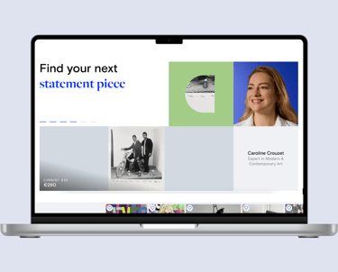
The Trade Activation Mode
Objective: Highlight special moments, which are standalone, cross-categories, and with an overarching narrative.This is a standalone mode, which means it will never live together with the Default mode.
Later iteration
After releasing the first iteration of the Homepage Hero, we started ideating on how to make the entire Homepage more relevant per each user segment, and even to each individual user.
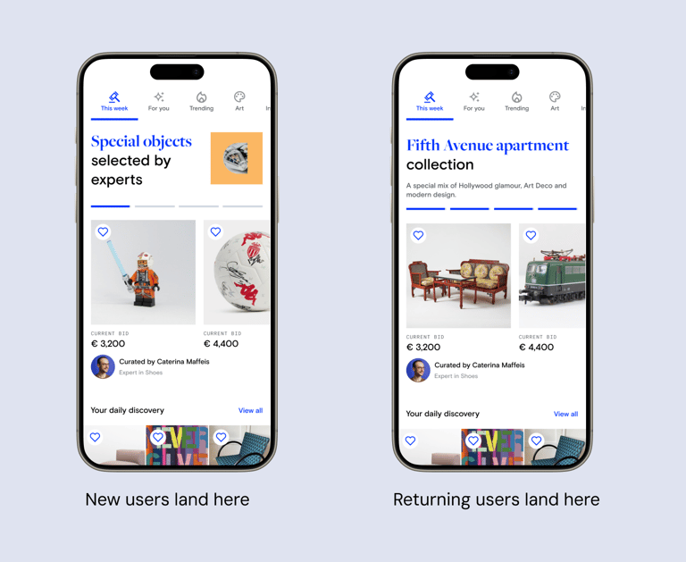
What change did we do?
If a logged out user (new user) lands on Catawiki Homepage, they will see the first Hero view (Catawiki view), which is relevant to this user because it clearly explains what it is and what's the value proposition.
On the other hand, if an existing user lands on the Homepage, there's no need to tell them what is Catawiki, so we land them on any other carrousel view.
How did we measure success?
Measuring metrics and determining if the new Hero contributed to higher conversions was not straightforward. We saw an increase on clicks and most importantly a significant increase on buyers after clicking on the hero. However, the main definition of success was contributing to an improved brand perception in the longterm.
We also measured success internally. With the old homepage hero operations, the team spent more than 7 hours weekly setting it up. The new homepage hero requires around 15 minutes to set it up. We automated many processes (translations and using product IDs to fetch information about the featured objects.All of these small changes made the process a lot smoother!